Every summer, interiors quietly go through a reset.
Not the dramatic kind with paint buckets and full renovations. More like a subtle shift in mood. Rooms get lighter, textures get softer, and suddenly everything starts feeling a little more breathable, like the space itself is exhaling.
This year’s summer decor trends are especially interesting because designers are leaning less into “theme-based styling” and more into atmosphere. It’s not about obvious coastal clichés or overly curated looks. It’s about spaces that feel effortless, layered, and naturally expensive without trying too hard.
So if your home is ready for that seasonal refresh, these are the summer decor directions designers are absolutely obsessed with right now.
1. Soft Neutral Layering Everywhere
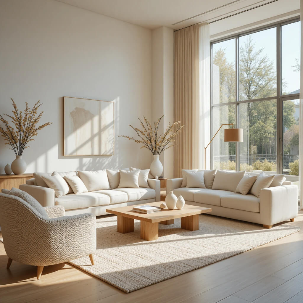
Neutral is no longer just beige on beige, it’s a full sensory experience.
Designers are layering creams, ivories, soft taupes, and warm whites to create rooms that feel airy but still dimensional. The key is mixing tones that are close in color but different in warmth and texture.
The result feels calm, expensive, and very intentionally undone.
Why This Works
Layered neutrals create depth without visual noise, which makes spaces feel larger and more serene.
2. Woven Textures Taking Over
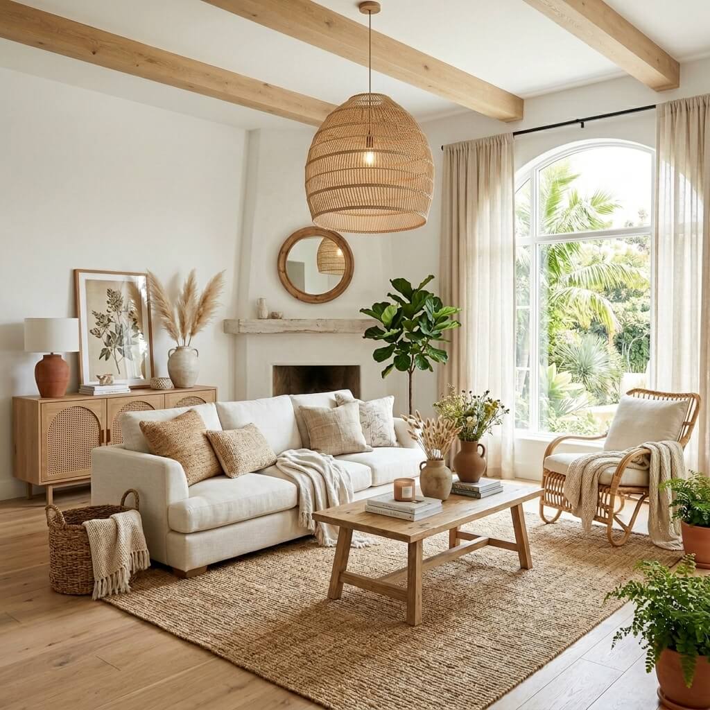
Rattan, cane, jute, seagrass — everything woven is having its moment.
These textures instantly make a room feel more relaxed and summer-ready. They soften modern interiors and add that organic warmth designers love.
It’s no longer just about accent chairs — woven textures are showing up in lighting, storage, and even wall decor.
Designer Tip
Mix fine weaves with chunkier textures to avoid a flat, repetitive look.
3. Low-Contrast Color Palettes
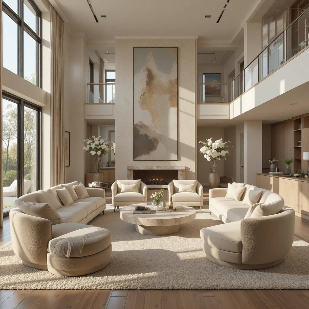
High contrast is stepping back this season.
Instead of sharp black-and-white pairings, designers are using softer transitions — like beige and ivory, sand and cream, or muted greens with warm neutrals.
The result feels more natural and visually restful.
Why This Works
Low contrast palettes reduce visual tension, making rooms feel calmer and more cohesive.
4. Oversized Organic Shapes
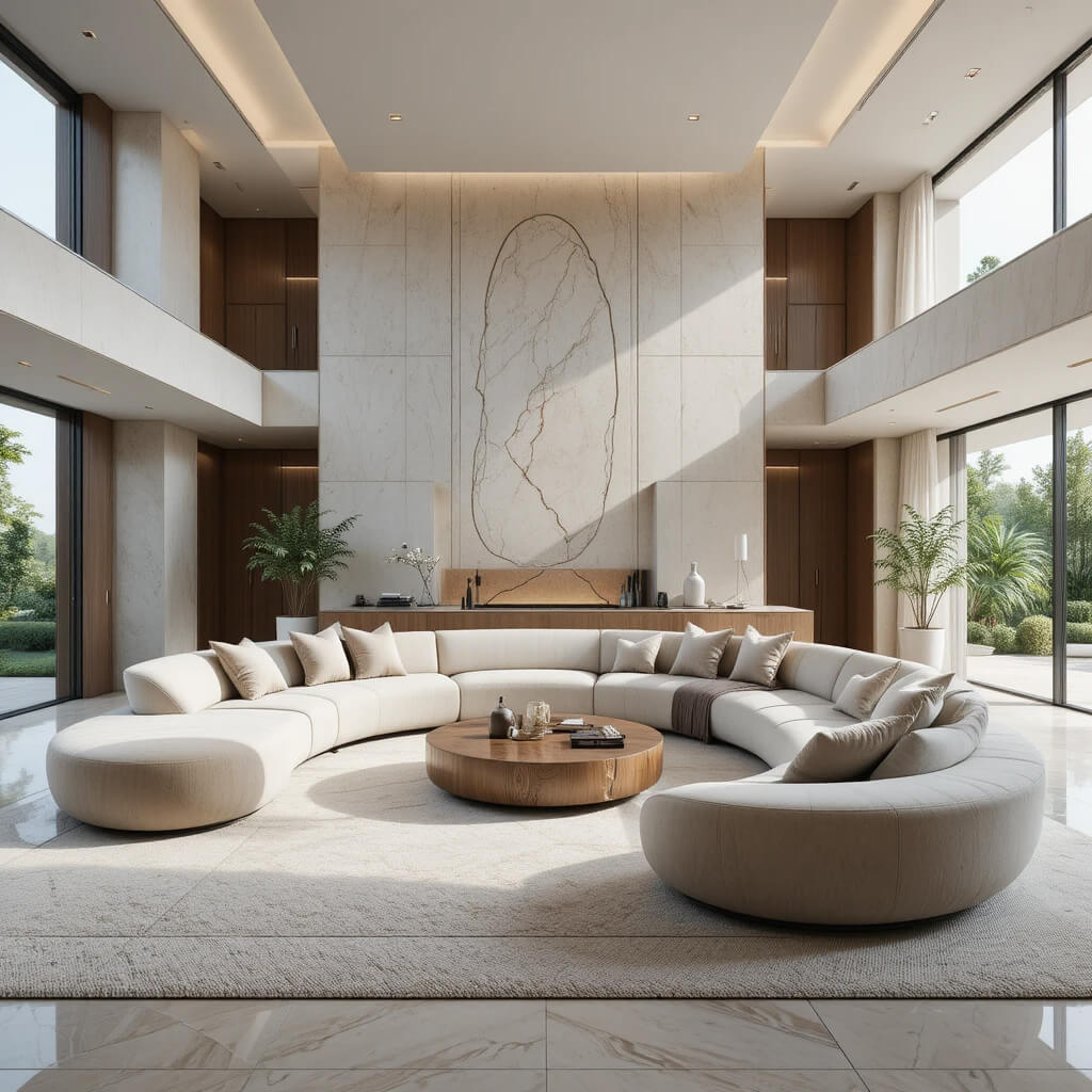
Sharp edges are slowly being replaced by curves.
Think rounded sofas, sculptural coffee tables, and soft, flowing silhouettes that feel almost architectural. These shapes bring a sense of ease into the room.
It’s modern, but without the rigidity.
Designer Tip
Balance curved furniture with grounded materials like wood or stone to keep the space from feeling too playful.
5. Sun-Faded Color Tones
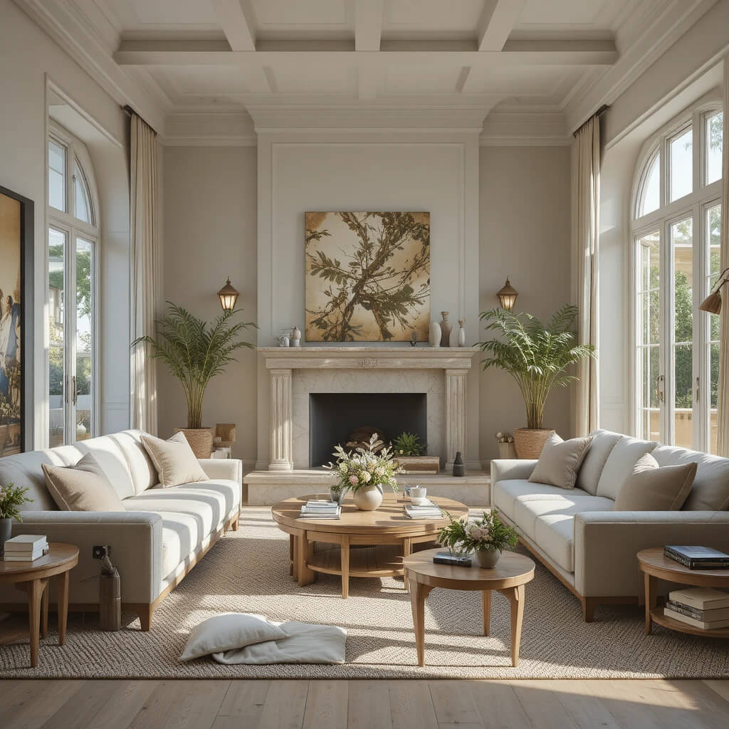
Bright, saturated colors are stepping aside for something more subtle.
Designers are favoring tones that feel naturally softened by sunlight — dusty blues, faded terracottas, muted olives, and warm pastels.
These colors feel lived-in and timeless rather than trendy.
Why This Works
Sun-faded tones mimic natural aging, which makes interiors feel more authentic and relaxed.
6. Linen Everything (Still, But Better)
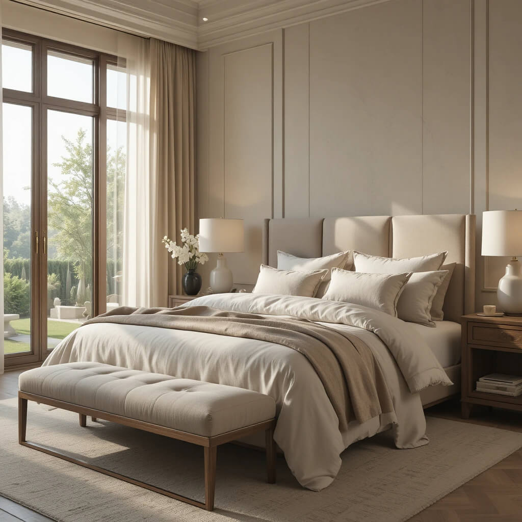
Linen isn’t new, but the way it’s being used is evolving.
Instead of just curtains and cushions, linen is now showing up in upholstery, lampshades, and layered textiles throughout the room.
The goal is maximum softness with minimal effort.
Designer Tip
Stick to slightly wrinkled finishes — they enhance the relaxed summer aesthetic.
7. Mixed Wood Finishes
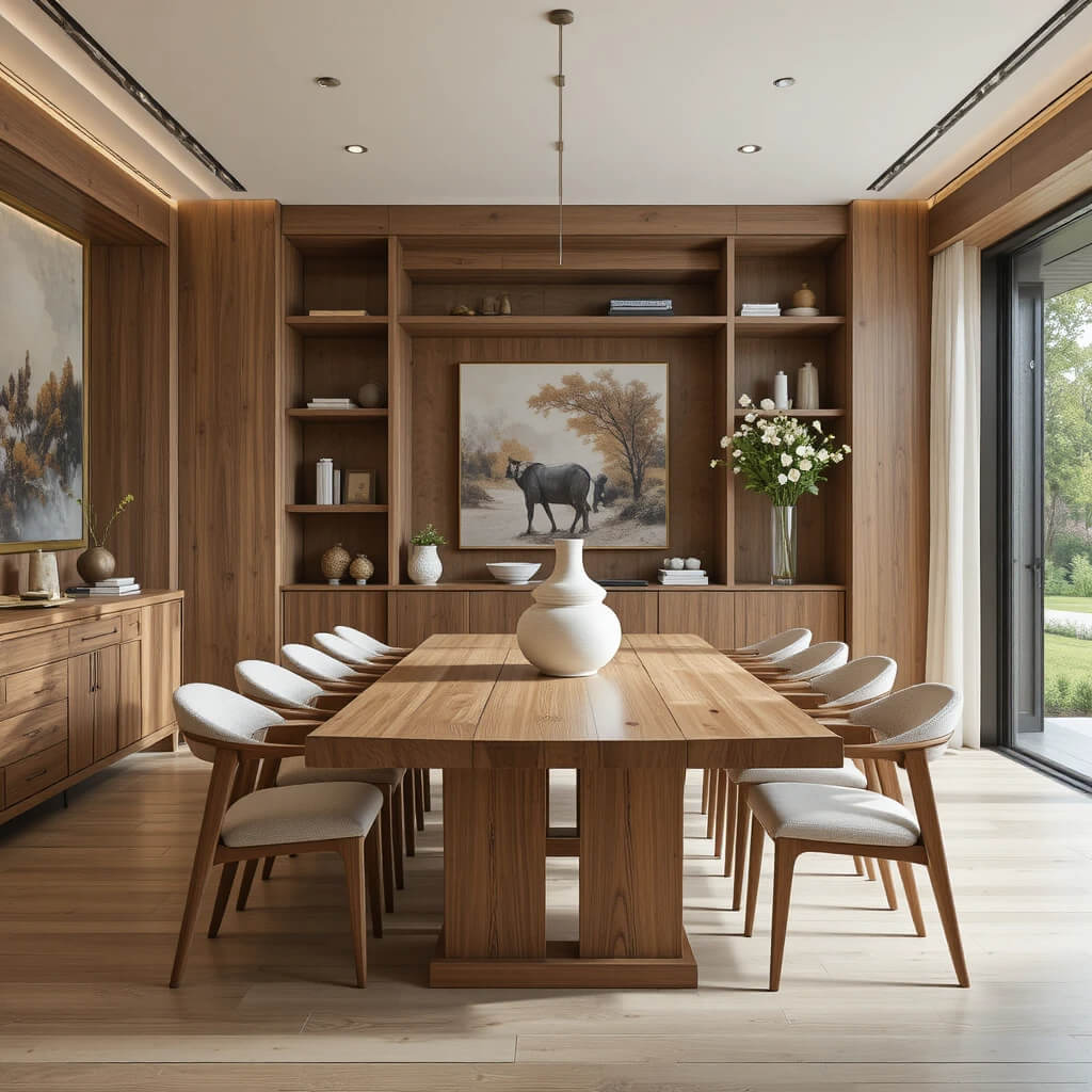
Perfectly matched furniture sets are officially out.
Designers are mixing light oak, walnut, ash, and even slightly weathered finishes in the same space. This adds depth and makes interiors feel more curated and less showroom-perfect.
It’s controlled chaos — but in a good way.
Why This Works
Mixed woods add variation without introducing color clutter.
8. Barely-There Curtains
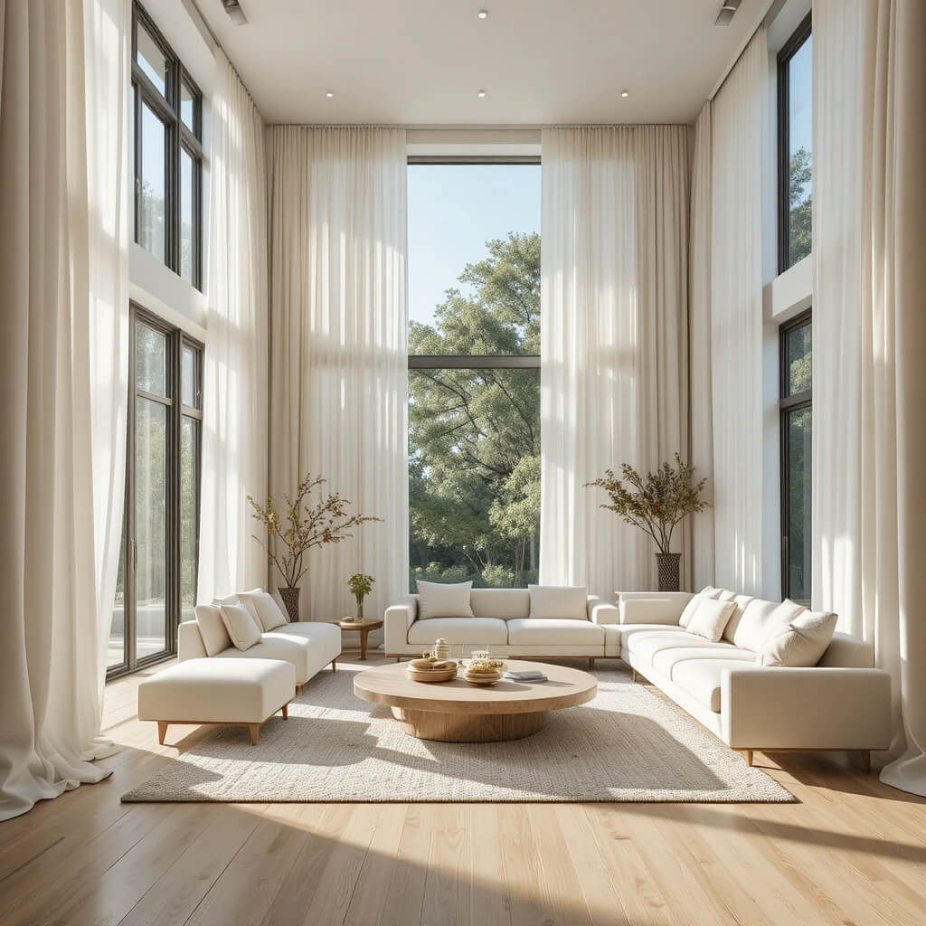
Heavy drapery is being replaced by soft, almost invisible window treatments.
Think sheer linen panels that filter light instead of blocking it. The goal is to maximize brightness while keeping a gentle sense of privacy.
Rooms instantly feel taller and more open.
Designer Tip
Hang curtains higher than the window frame to enhance the airy effect.
9. Warm Minimalism
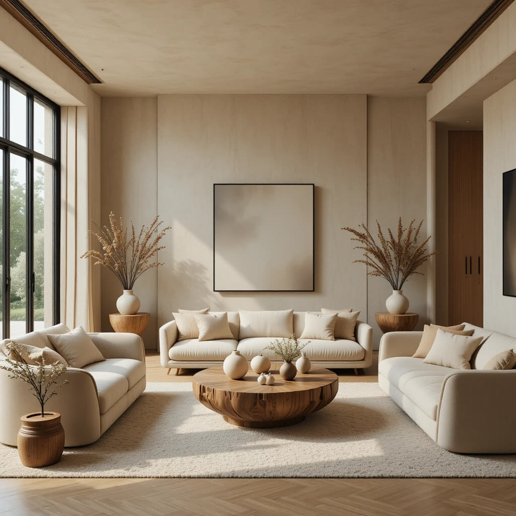
Minimalism is no longer cold or overly strict.
This summer, it’s about soft edges, warm tones, and intentional simplicity. Instead of empty spaces, you get thoughtfully edited ones.
It feels calm, but still lived in.
Why This Works
Warm tones prevent minimal spaces from feeling sterile or emotionally flat.
10. Nature-Inspired Accents
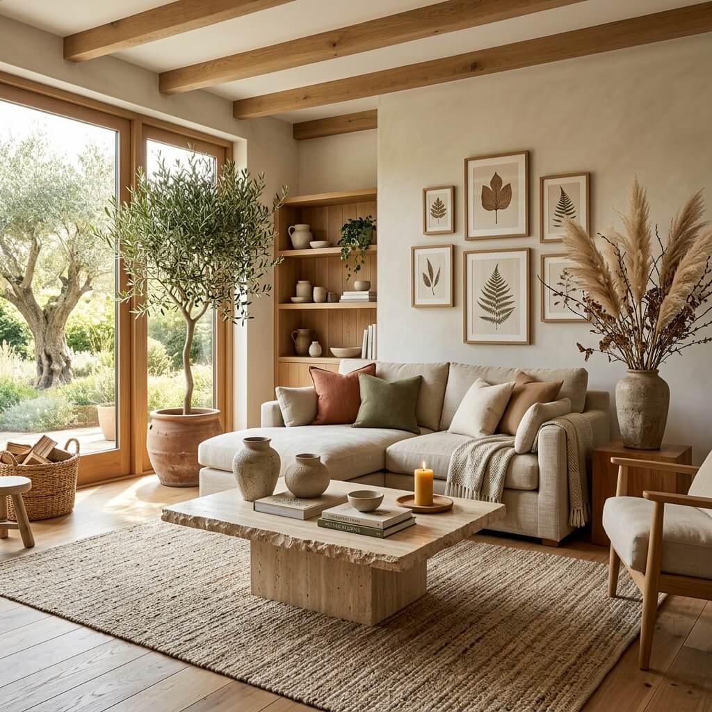
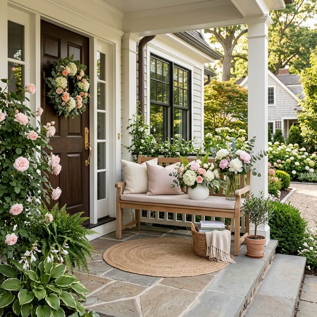
Bringing the outside in is still a major theme — but more subtly now.
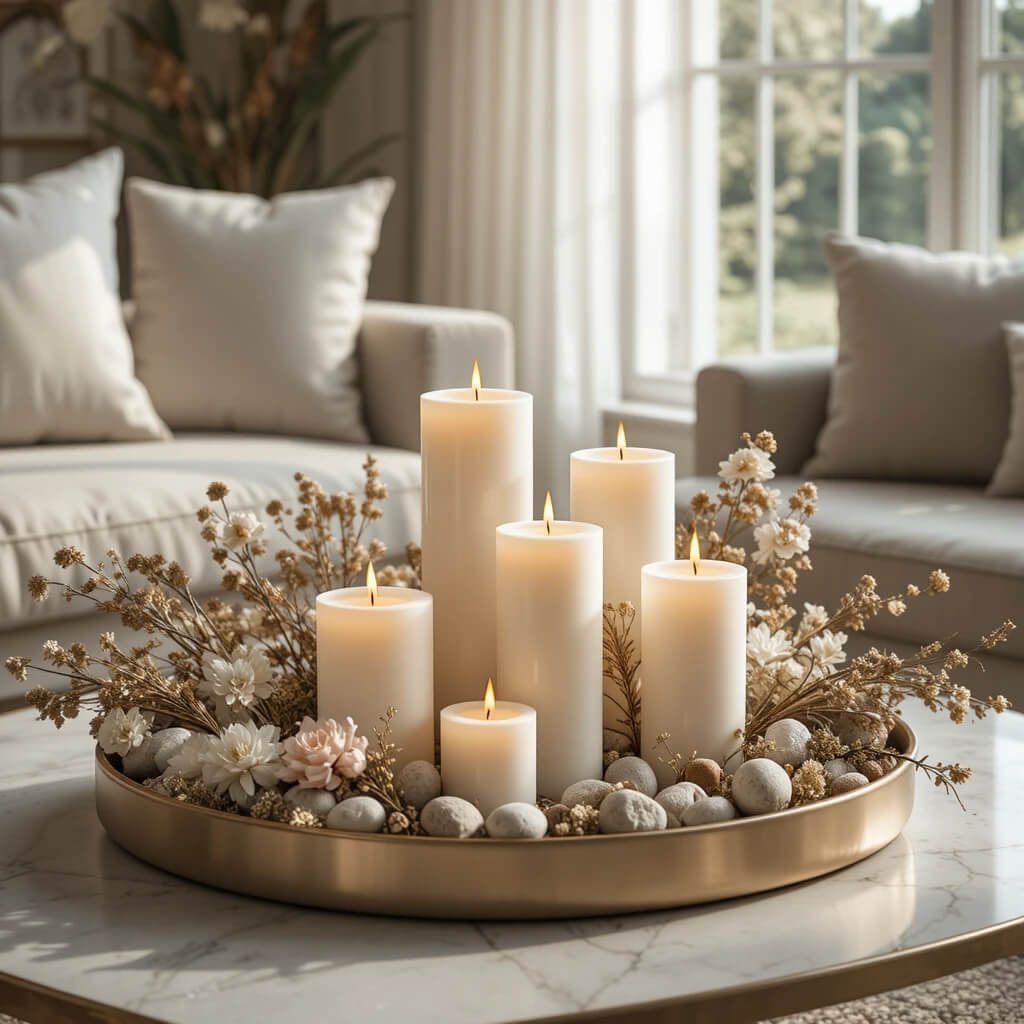
Instead of obvious plant overload, designers are focusing on natural references like stone textures, botanical prints, dried arrangements, and earthy ceramics.
It feels organic rather than styled.
Designer Tip
Use plants as structure, not decoration — one large statement piece often works better than many small ones.
11. Soft Metallic Touches
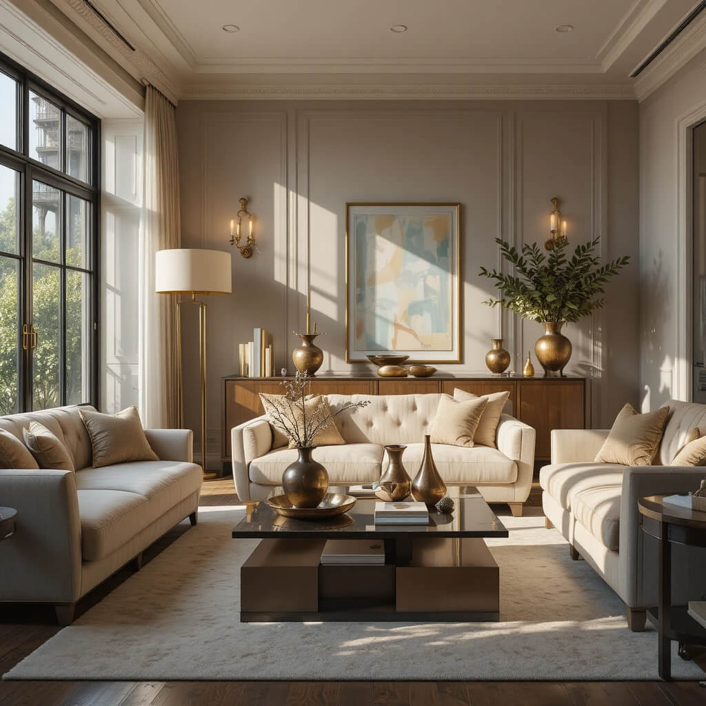
Cold chrome is stepping back in favor of warmer metals.
Brushed brass, aged gold, and soft bronze are being used sparingly to add glow without overpowering the space.
It’s less shine, more warmth.
Why This Works
Soft metals reflect light gently, enhancing the summer brightness of a room.
12. Low Furniture Styling
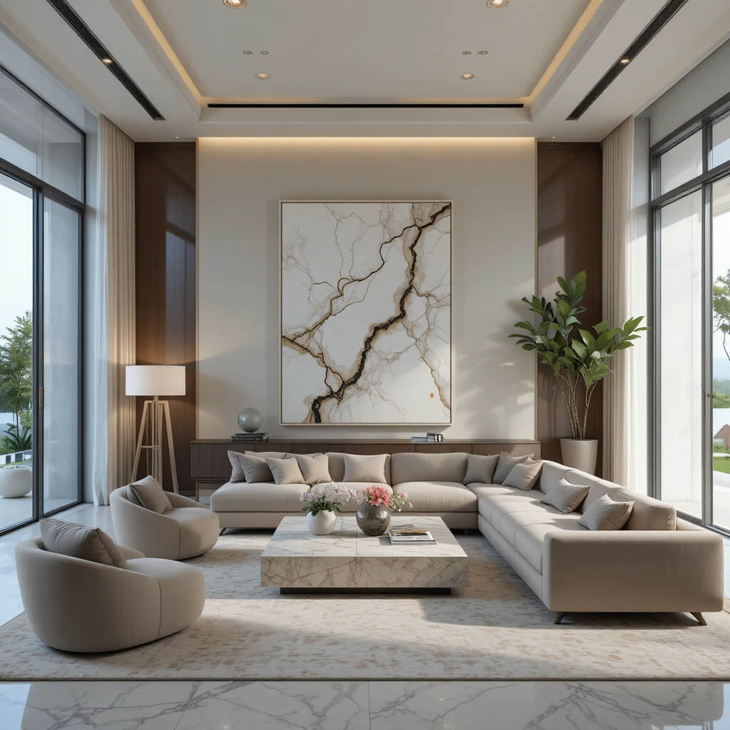
Designers are pulling furniture closer to the ground.
Low-profile sofas, lounge seating, and grounded coffee tables create a relaxed, almost resort-like feel. It makes rooms feel more spacious vertically.
The vibe is effortless lounging.
Designer Tip
Pair low furniture with tall decor elements like oversized lamps or art for balance.
13. Layered Lighting Scenes
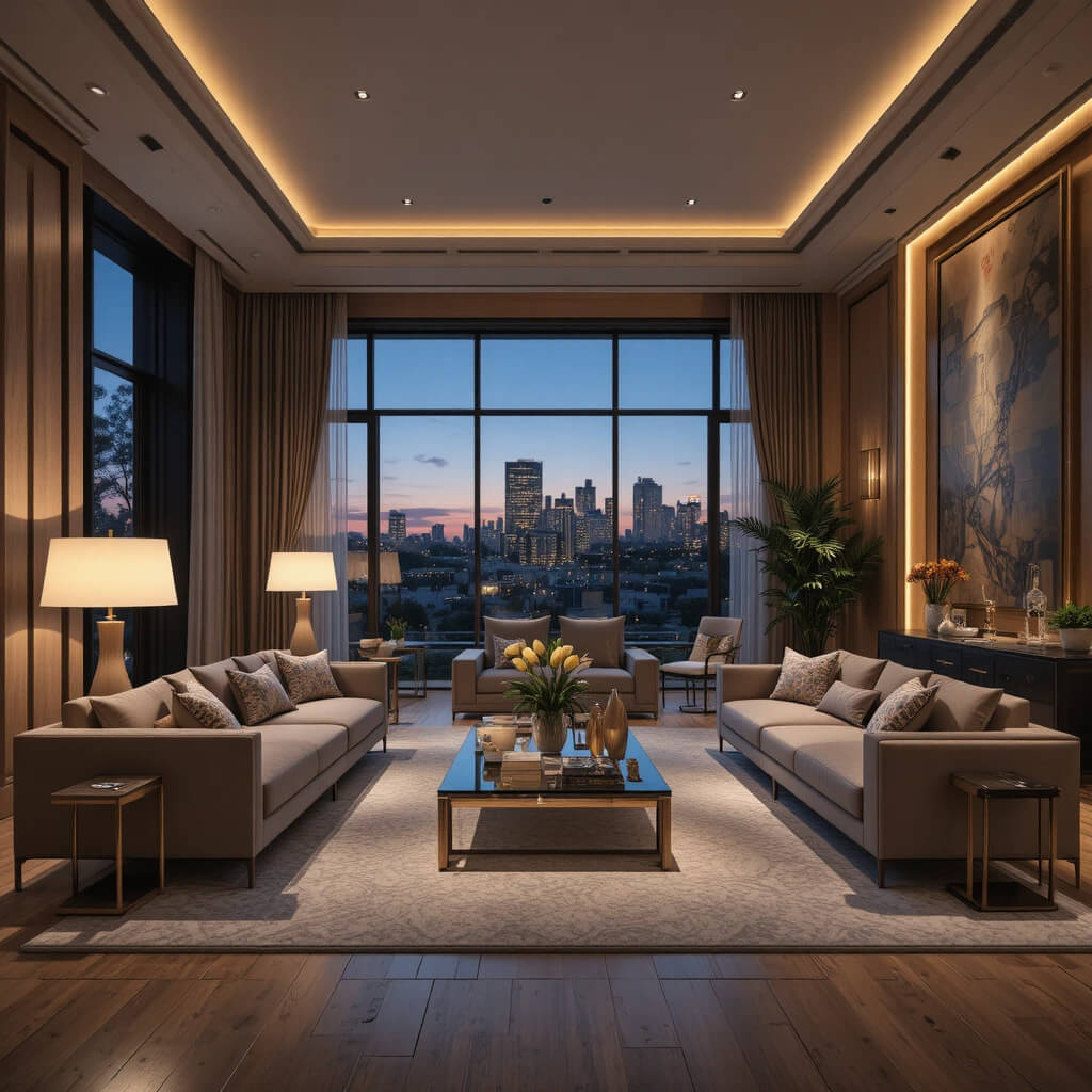
Single overhead lighting is officially out.
Instead, designers are building multiple lighting layers — table lamps, floor lamps, wall sconces, and soft ambient lighting working together.
This creates mood flexibility throughout the day.
Why This Works
Layered lighting allows spaces to shift from bright daytime energy to soft evening warmth.
14. Soft Earthy Greens Everywhere
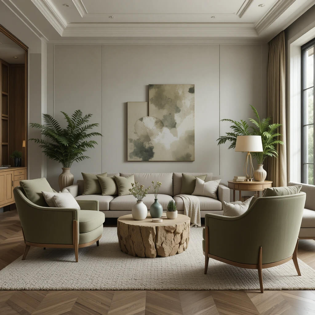
Green is still dominant, but in a much calmer way.
Sage, olive, and muted moss tones are replacing brighter greens. These shades blend seamlessly into neutral interiors without feeling overpowering.
They bring life without noise.
Designer Tip
Use earthy greens as grounding accents rather than dominant wall colors.
15. Textured Walls Over Flat Paint
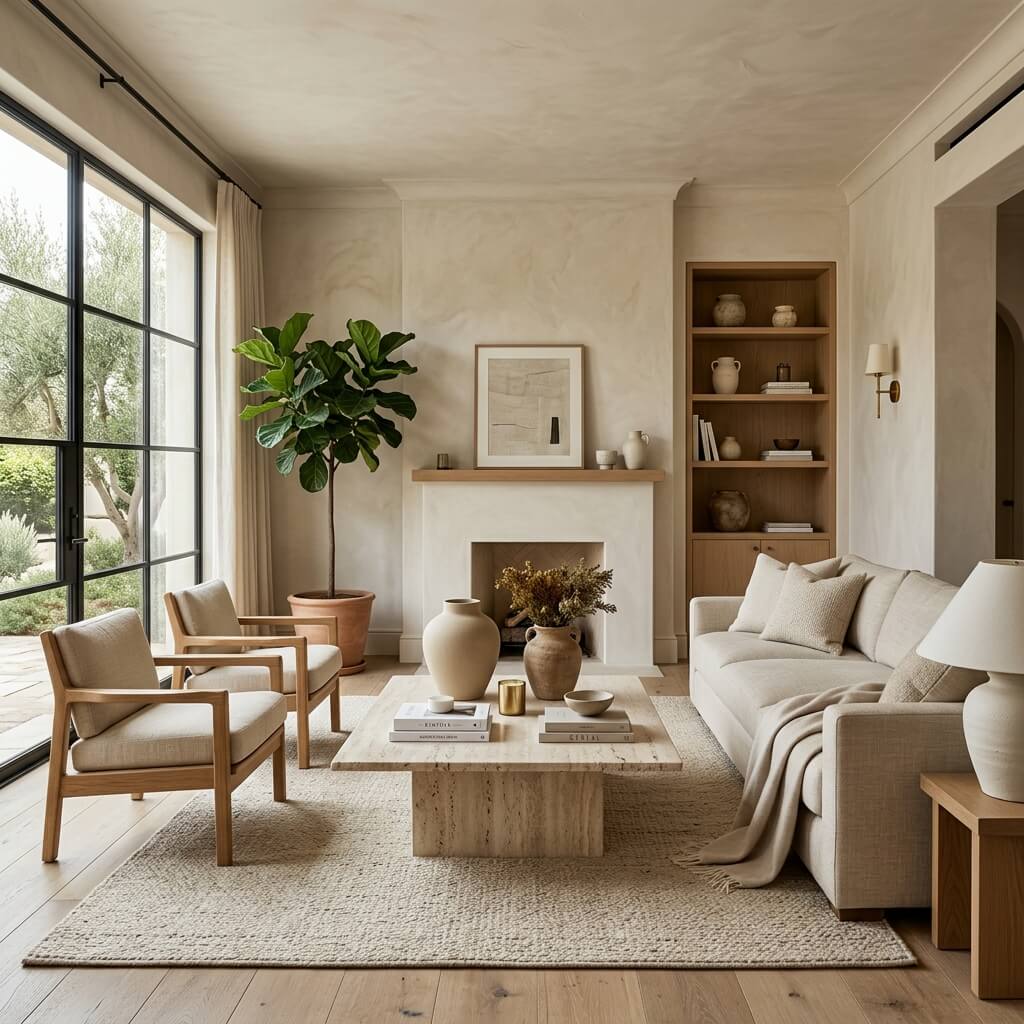
Flat, perfectly smooth walls are starting to feel a bit too polished.
Designers are embracing limewash, plaster finishes, and subtle texture variations that add depth and movement.
Even neutral walls suddenly feel more expensive.
Why This Works
Texture catches light in a way flat paint simply can’t replicate.
16. Curated Clutter Styling
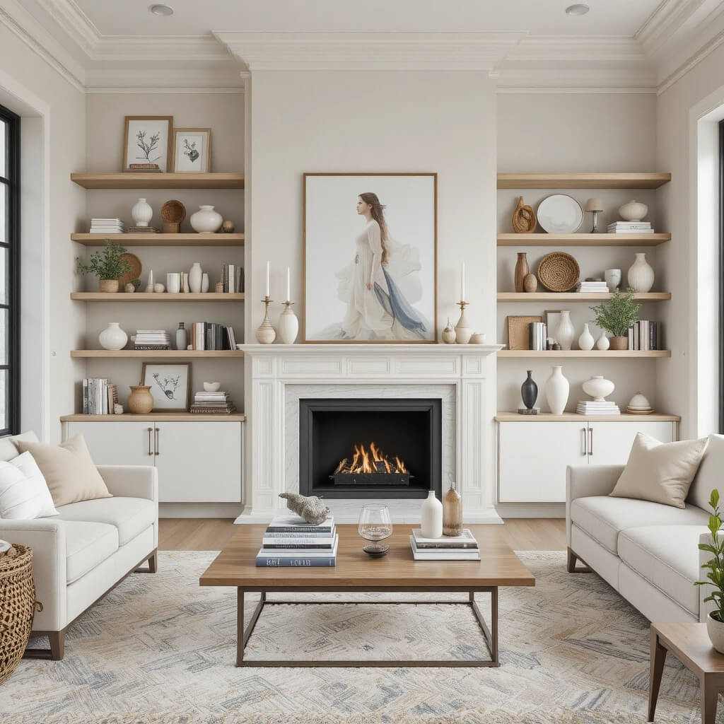
Empty shelves are being replaced with intentional layering.
Instead of minimal decor, designers are styling objects in small, curated clusters — books, ceramics, art pieces, and personal accents arranged thoughtfully.
It feels collected, not decorated.
Designer Tip
Stick to a tight color palette even when layering objects to avoid visual chaos.
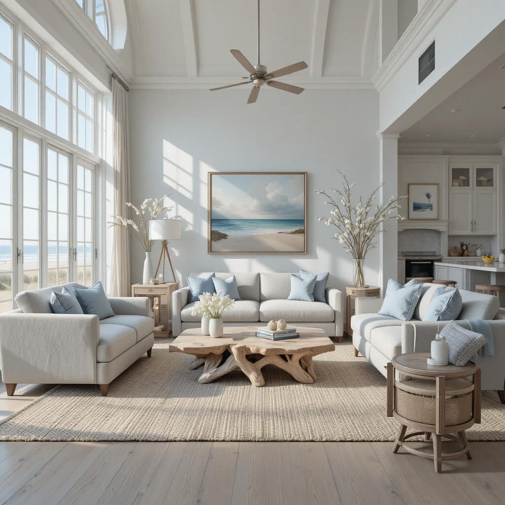
17. Coastal Influence (But Refined)
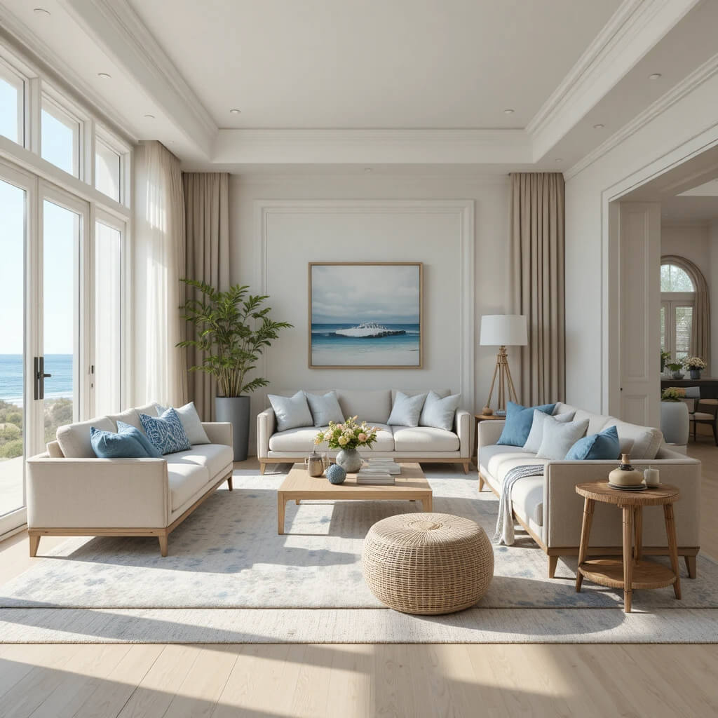
Coastal design is still present, just more sophisticated.
Instead of shells and anchors, it’s now about soft blues, sandy neutrals, airy fabrics, and subtle ocean-inspired tones.
Think “luxury beach house” rather than “theme decor.”
Why This Works
Refined coastal styling feels timeless instead of seasonal or kitschy.
18. Indoor-Outdoor Flow Design
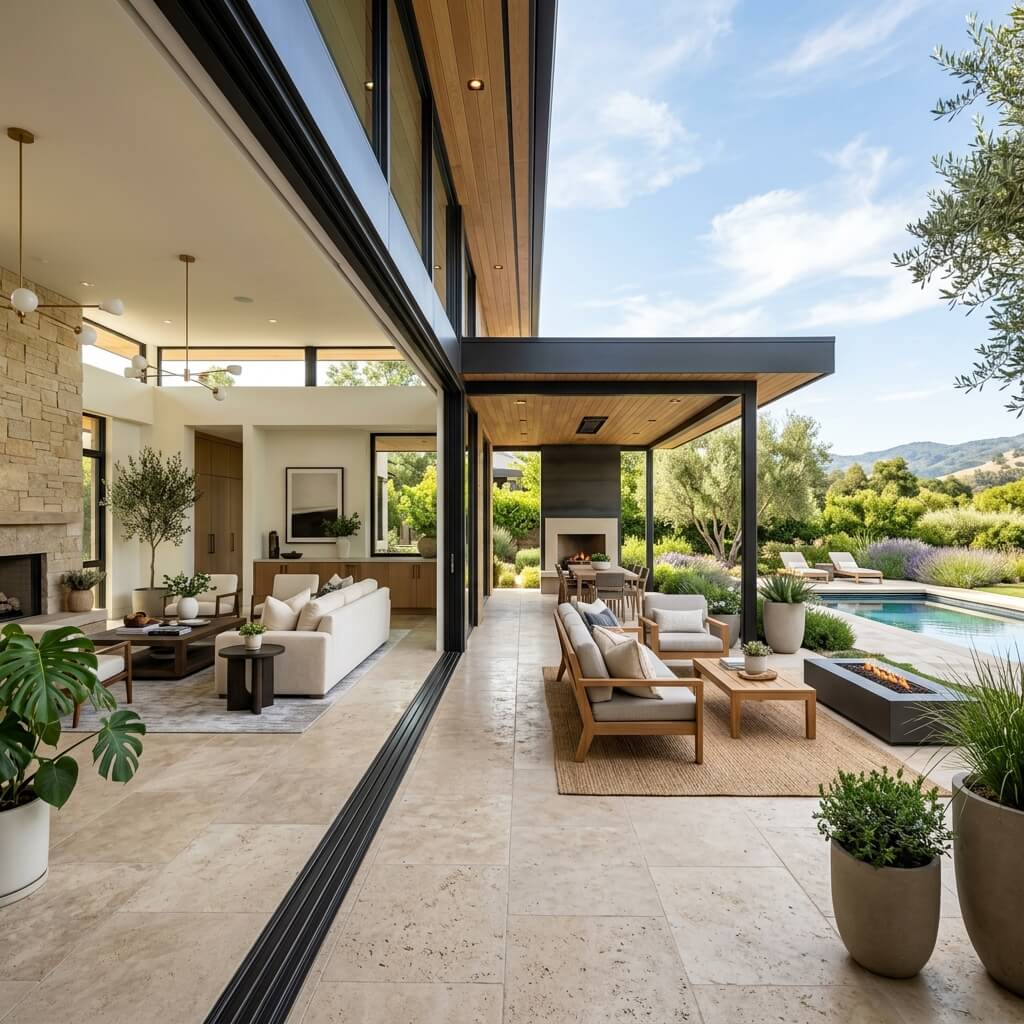
Blurring the line between inside and outside is a major focus this year.
Large windows, sliding doors, matching indoor-outdoor materials, and cohesive color palettes are making homes feel more connected to nature.
It’s about extending the living space visually and physically.
Designer Tip
Repeat one or two materials inside and outside to create seamless continuity.
Final Thoughts
This year’s summer decor trends all share one clear direction — softness, restraint, and intentional imperfection.
Instead of overly styled spaces, designers are leaning into rooms that feel breathable, natural, and quietly expensive. It’s less about decorating and more about curating a feeling.
Whether it’s layered neutrals, organic shapes, or softened natural materials, the goal is the same: a home that feels lighter the moment you walk in.
Because the best summer interiors don’t just look good, they feel like a deep breath you didn’t realize you needed.